Logo
Logo layouts
To ensure the MoMo logo is easily recognizable when paired with other elements, such as department names or partner logos, follow these simple layout guidelines.
Internal department
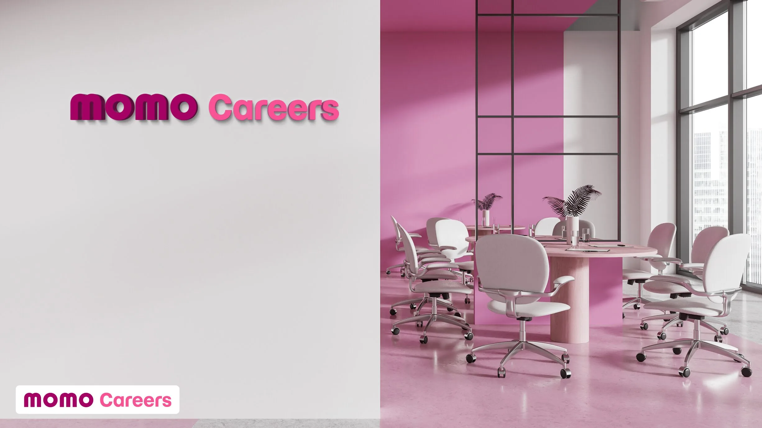
For internal departments and programs, use the horizontal MoMo logo alongside the department name. The example below shows how to apply the logo using both the primary and secondary brand colors for department signage.

General design standards
Place the horizontal MoMo logo on the left and the department or program name on the right. The spacing between the logo and the text should be half the width of the “O” in the logo.
For the best visibility on communication platforms (like in-app banners or printed materials), leave a safe zone around the logo. This safe zone should be equal to the height and width of the “O” in the logo.
Follow the guidelines to maintain this safe zone, ensuring no text or design elements cross the baseline or cap height of the logo.


Partnership
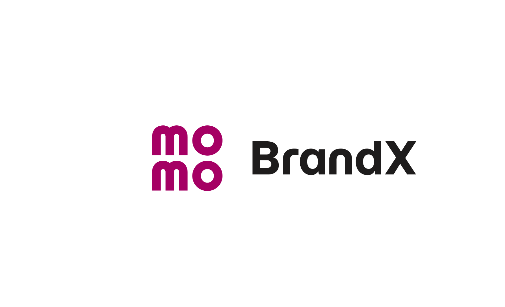
When designing materials involving partner logos, always pair the MoMo logo with the partner logo following these guidelines.
The example below shows how to combine the MoMo logo with a partner’s logo to ensure both are displayed clearly and consistently.

General design standards
Place the MoMo logo on the left and the partner logo on the right. The space between the two logos should equal the width of the “O” in the MoMo logo.
For clear and consistent visibility across platforms (such as banners or printed materials), leave a safe zone around the MoMo logo. This safe zone should match the size of the “O” in the logo.
Follow the guidelines to maintain this safe zone. Ensure no rounded characters or elements cross the baseline or cap height.