Typography
MoMo font
The MoMo font system consists of 3 font families:
MoMo Trust Sans (sans-serif font)
MoMo Trust Display (sans-serif font for headlines)
MoMo Signature (handwritten font)
The fonts are specially designed by Type Associates, inspired by the MoMo logo and user handwriting. They form a flexible, minimalist, and highly usable combination, designed to be user-friendly.
Font system


MoMo font weights
MoMo Trust Display: Only 1 weight available.
MoMo Trust Sans: Includes 3 available weights which are Medium, Regular, and Light.
MoMo Signature: Only 1 weight available.
Font usage guidelines
The correct use of fonts is crucial in expressing and delivering content.
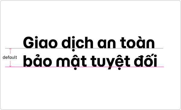
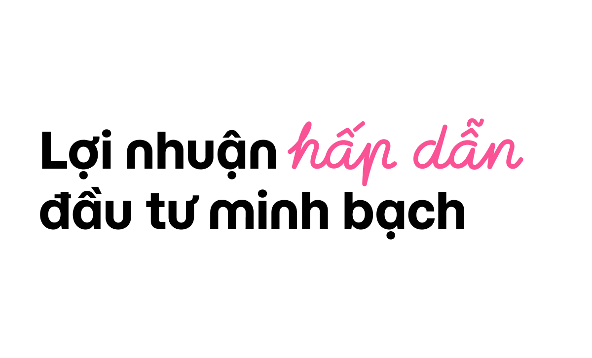
MoMo Trust Display should be used for headlines to emphasize and draw attention to the main content of the design.
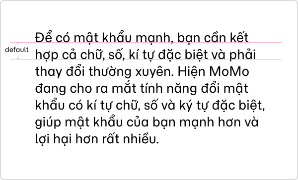
MoMo Trust Sans should be used for supporting and explaining the headline or for displaying long paragraphs in texts, banners, and printed materials.
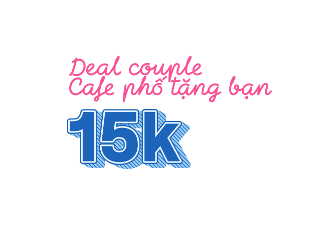
MoMo Signature – This handwritten font is typically used alongside MoMo Trust Display for special words or phrases within a headline.
MoMo Trust Display for headline
MoMo Signature for highlight text
MoMo Trust Sans (Medium and Regular weights) for body text
Default spacing
Default spacing
The default spacing for MoMo Trust Display and MoMo Trust Sans fonts has been set in the font system (including line spacing and letter spacing).
These spacing guidelines ensure users can easily read content across all MoMo applications and platforms.
Spacing guidelines:
Leading: Automatic (122% of font size).
Tracking: 0.
Kerning: Automatic.


Font setup
Font spacing setting
The line spacing of MoMo Trust Display is automatically set to ensure clear content display.
When used for outdoor billboards, this spacing can be tightened (compared to the default) to create a more compact layout and structure. However, this requires approval from the brand team.
The default line spacing for MoMo Trust Sans is designed for all use cases. If any adjustments are needed, consult the brand team.

Headline content. Body content. Highlighted headline content.

Letter spacing
When using MoMo Trust Display for headings, the letter spacing should be close together with default adjustments. For long paragraphs with smaller text sizes, MoMo Trust Sans should be used, with default letter spacing.
If letter spacing adjustments are required, approval from the brand team is needed.
Headline content. Body content. Highlighted headline content.


Font usage
Font alignment
Alignment standards in text design ensure consistency across MoMo’s graphic applications.
Left alignment: Used for long-form text and paragraphs.
Center alignment: Used for clusters of short text or phrases.
Left alignment. Right alignment.


Font formatting
MoMo Trust Display should be used for headlines (typically 3 to 10 words) and for text placed above or beside images and other graphic elements.
MoMo Trust Sans should be used for longer text (10+ words) and small-sized text.

Regular text.

Uppercase text.

Font selection
MoMo Trust Display should be used for headlines (3 to 10 words) and long text. This text is usually placed above or adjacent to images or other graphic elements.
MoMo Trust Sans should be used for longer text (10+ words) and for small-sized text.
Correct font selection.


Incorrect font selection.

Improper usages
Headlines

Don’t place characters too close. 
Don’t excessively space out the characters. Don’t use outdated fonts. Don’t use right alignment. Don’t use regular fonts for emphasis. Don’t use highlighted fonts in the middle of a sentence or for individual words. Don’t overlay images on text. Don’t apply gradients on text.





Boxy text
Don’t use MoMo Trust Display for both headlines and body text. Don’t use bold weights other than the regular for long paragraphs. Don’t replace the word “MoMo” with the logo. Don’t use all-caps for long paragraphs. Don’t use center alignment for long paragraphs. Don’t overuse emphasis (bold, underline, strikethrough) in the same paragraph.


Highlighted text
Don’t combine different highlighted font styles in a single headline. Don’t use highlighted fonts for the entire headline.