Logo
Logo variations
In addition to the main logo, MoMo also offers alternative logo variations designed specifically for various purposes. Each version follows distinct guidelines to ensure consistency and suitability for every application.
Refer to the following guidelines to effectively use these logo versions.
Horizontal logo
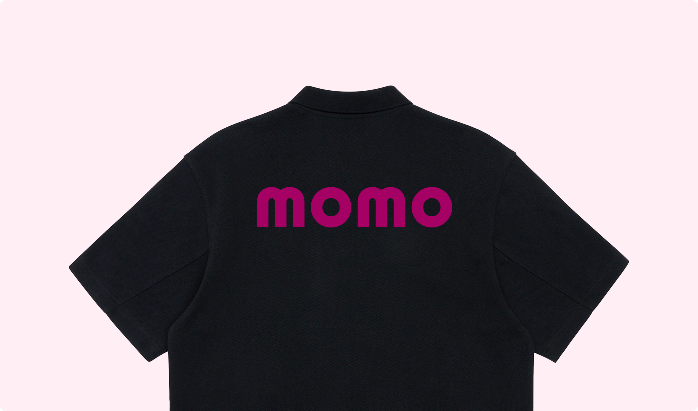
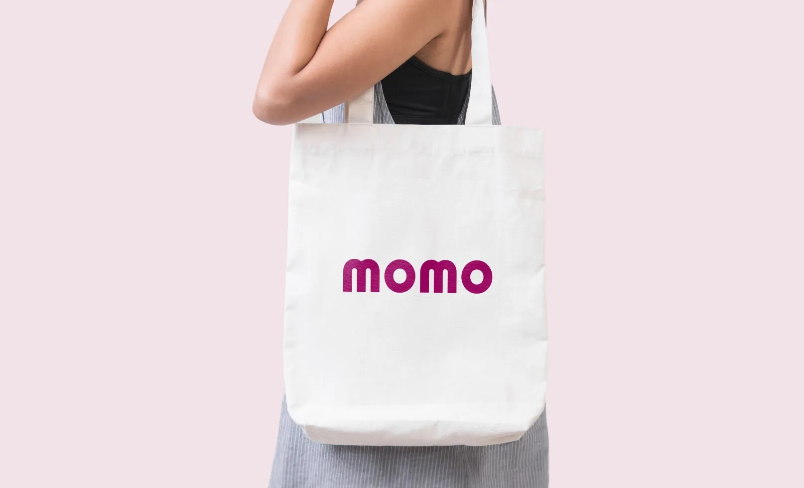
The horizontal logo is a secondary logo used mainly for internal purposes, such as department allocation or event materials. For any other use, please consult the branding team for detailed support.
Safe zone
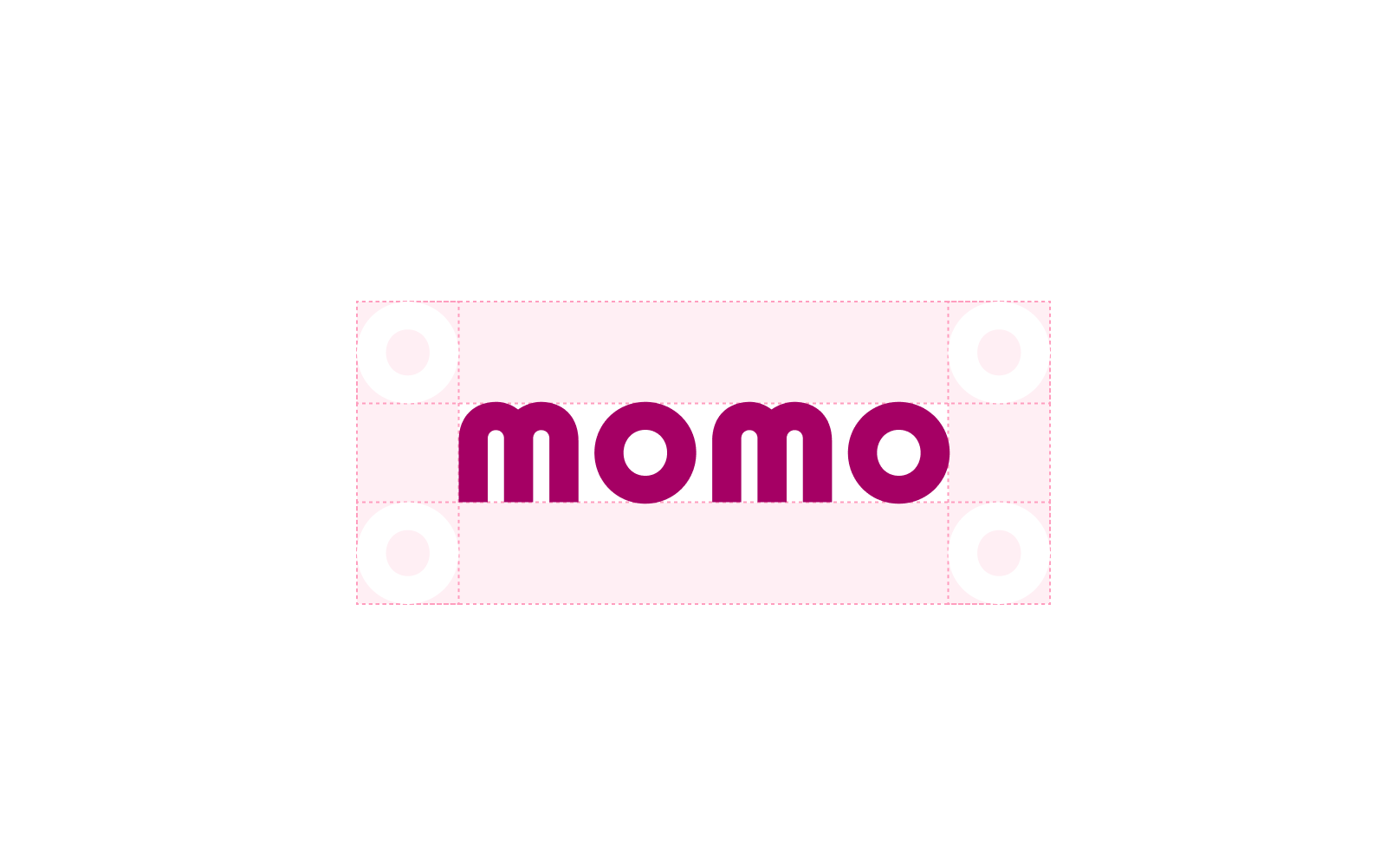
To ensure clarity, the horizontal logo should be centered with equal spacing around it. The spacing should match the height and width of the “O” in the logo.
Follow the guidelines for precise alignment, ensuring the characters do not exceed the baseline or cap height.
Minimum size
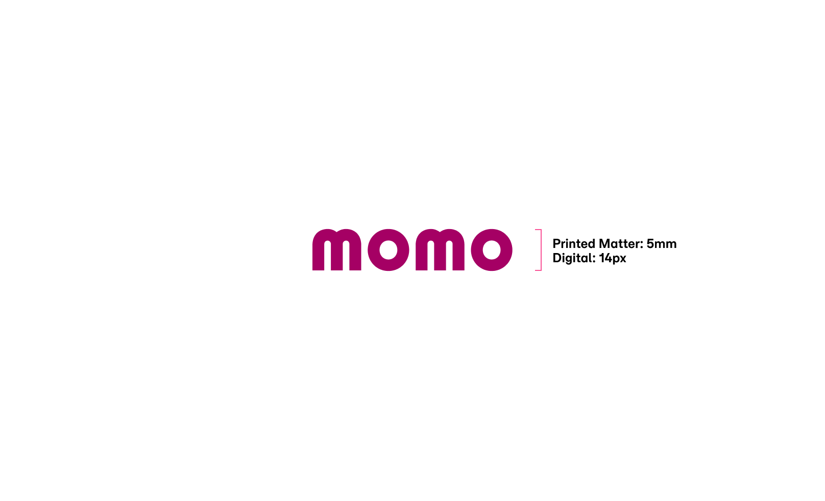
To maintain clarity and avoid losing details, adhere to the following size requirements:
Printed materials: The MoMo logo should not be smaller than 5mm.
Digital platforms: The MoMo logo should not be smaller than 14px.
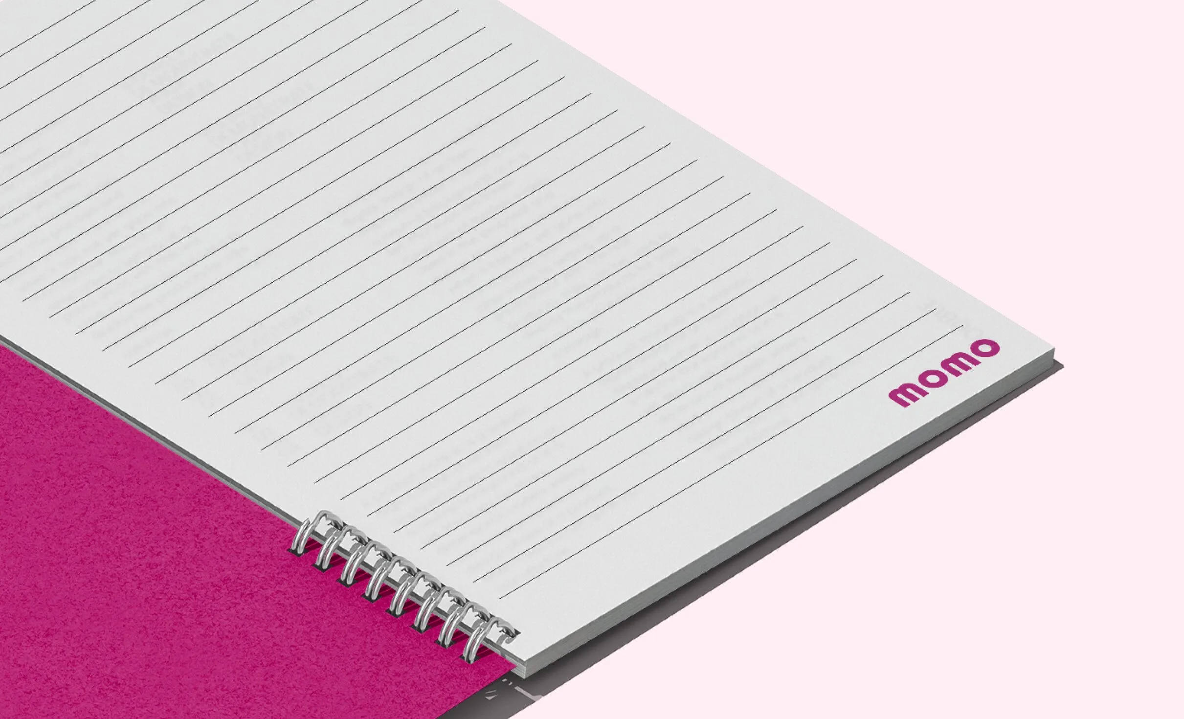
Color usage for the horizontal logo
MoMo logo colors on colored backgrounds
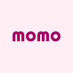
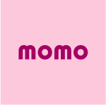
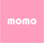
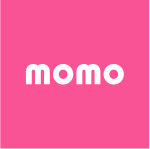
Below are the guidelines for using the secondary logo on colored backgrounds to ensure optimal contrast. Make sure to use the correct color combinations as listed, with each background color requiring the corresponding logo color.
Since the secondary logo is primarily for internal use, its color palette is limited to the brand’s signature colors and the pink secondary palette.

Improper usages
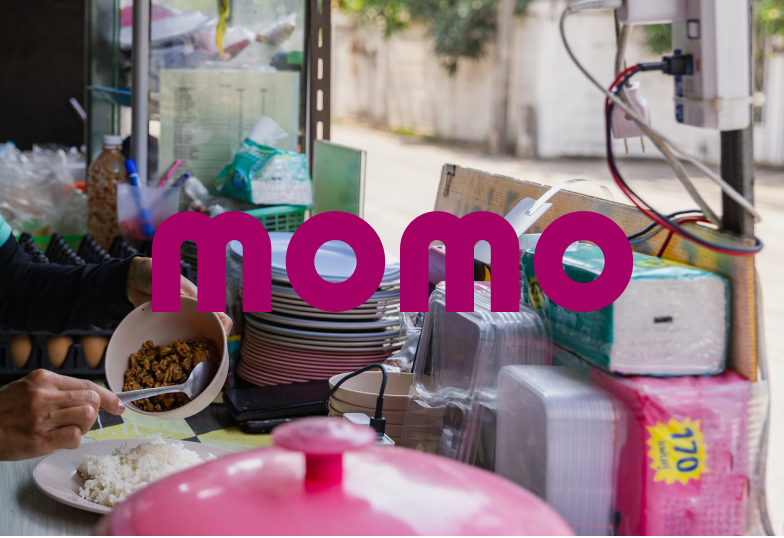
To ensure consistent brand recognition, the MoMo logo must remain unchanged and adhere to the defined brand usage guidelines. Below are examples of improper logo applications.
For any logo applications not mentioned in the brand guidelines, consult the brand management team before proceeding.

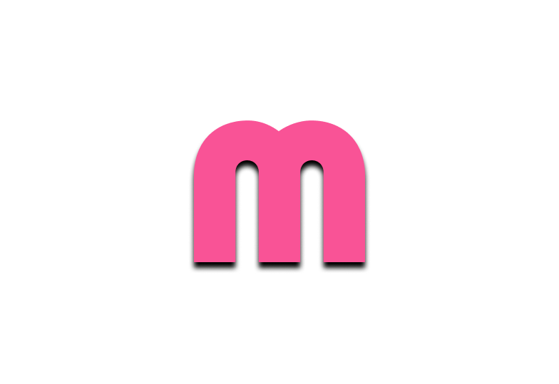
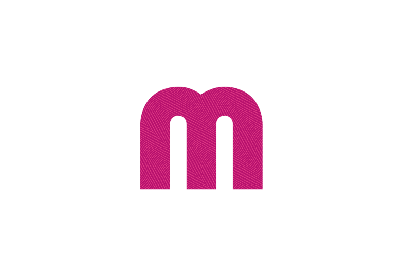
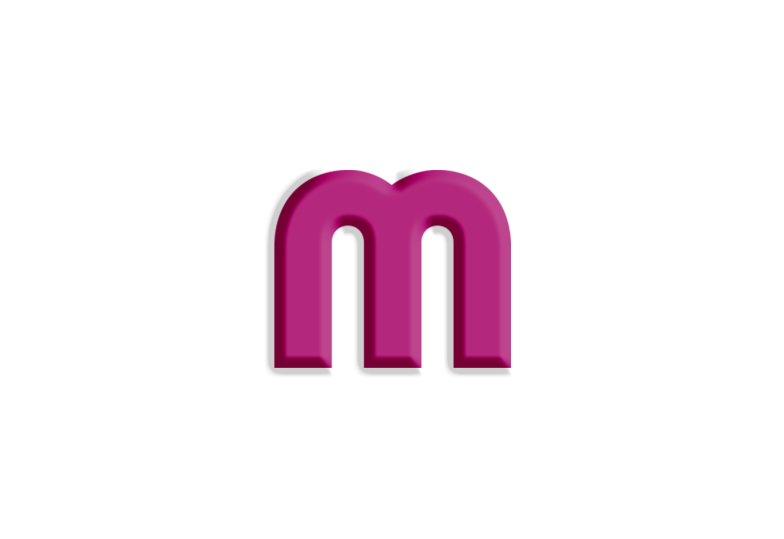
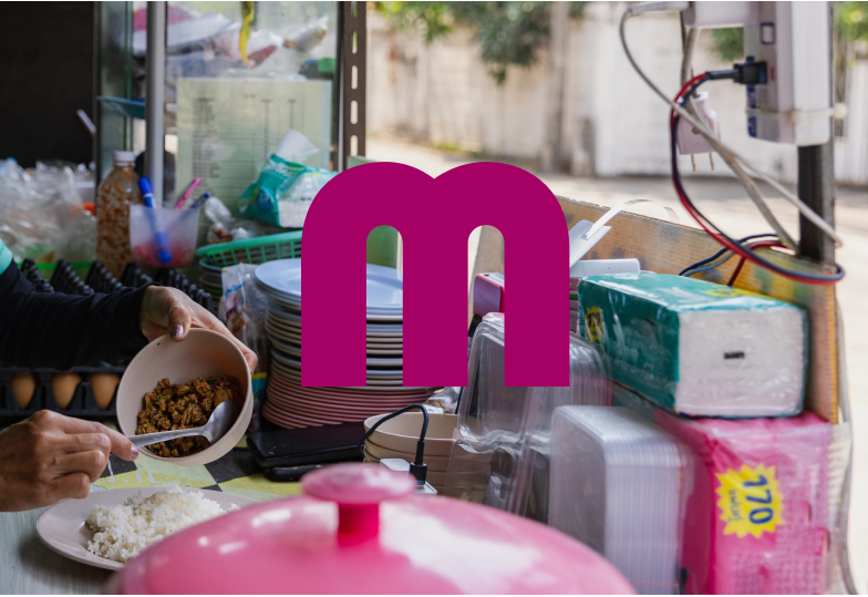
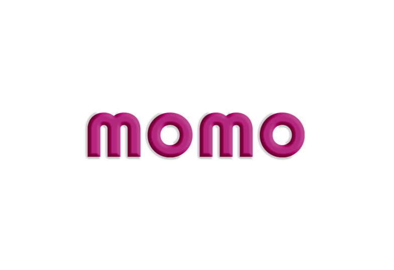
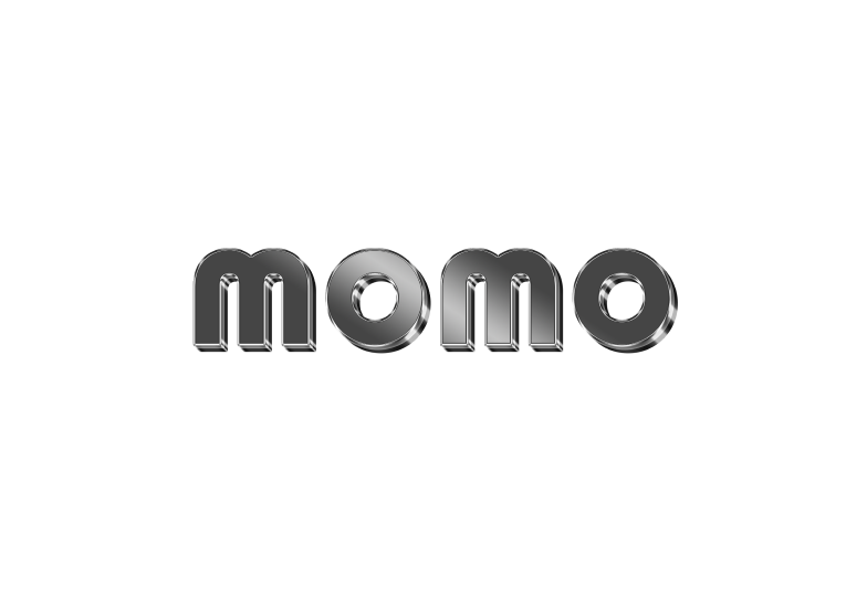
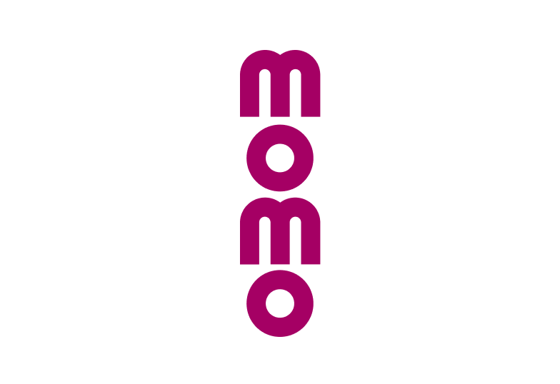
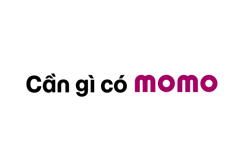
Using incorrect logo colors. Misusing logo-background color combinations. Changing the logo's opacity. Using outdated versions of the logo with the wordmark. Placing the logo within a frame. Adding shadow effects to the logo. Overlaying patterns on the logo. Adding embossing effects. Adding textures or 3D effects to the logo. Altering the logo's structure or layout. Using an outlined version of the logo. Distorting or resizing the logo disproportionately. Replacing the word "MoMo" with the logo in text. Misusing secondary logos or the 'M' symbol as the primary identifier. Placing the logo on overly detailed backgrounds.





Main logo on application icons
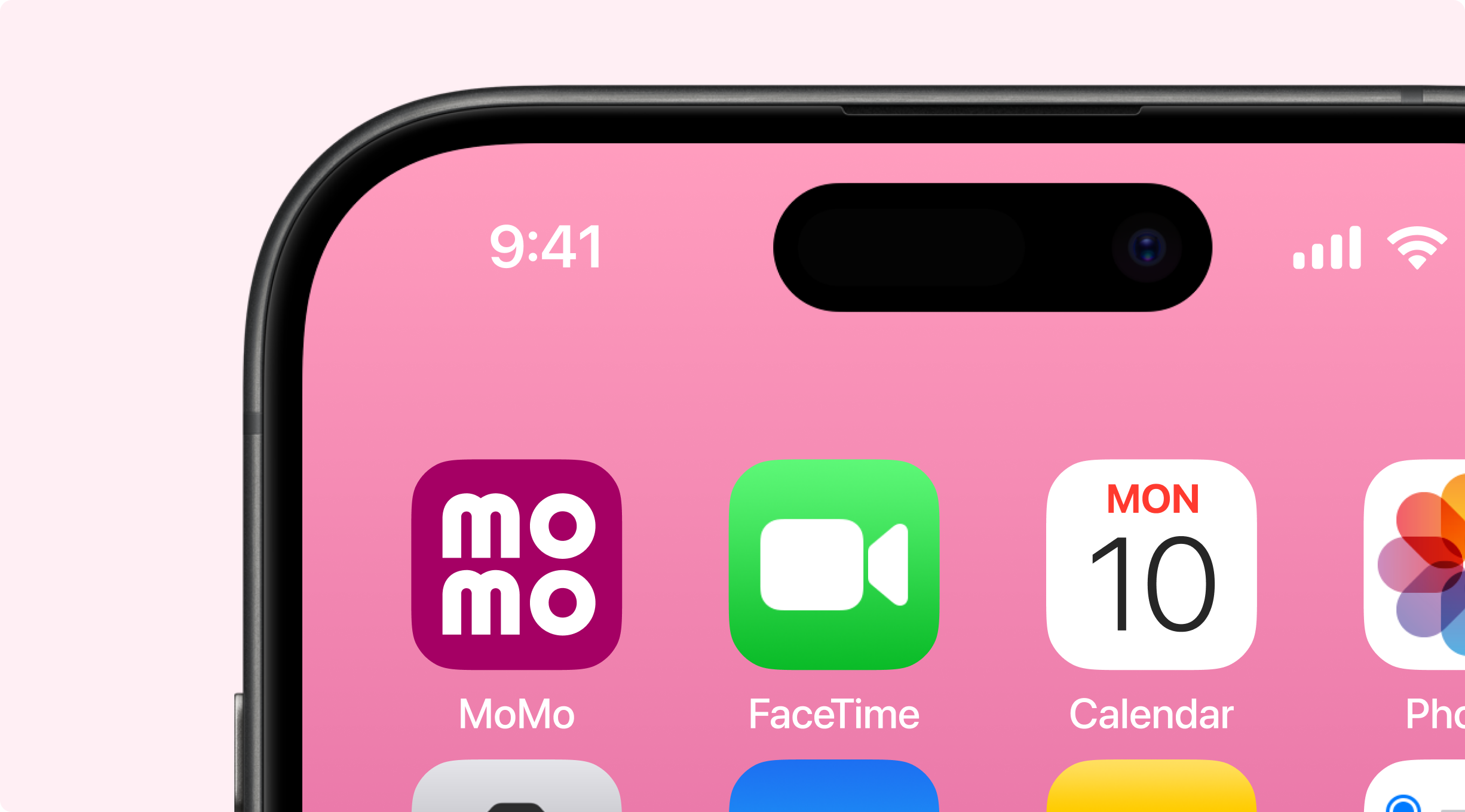
On operating systems, apps, app stores, and mobile platforms, the primary logo is displayed against MoMo Pink, the signature color background, and fits within the defined framework and safe zone specifically designed for app icons.
Grid system for app icons
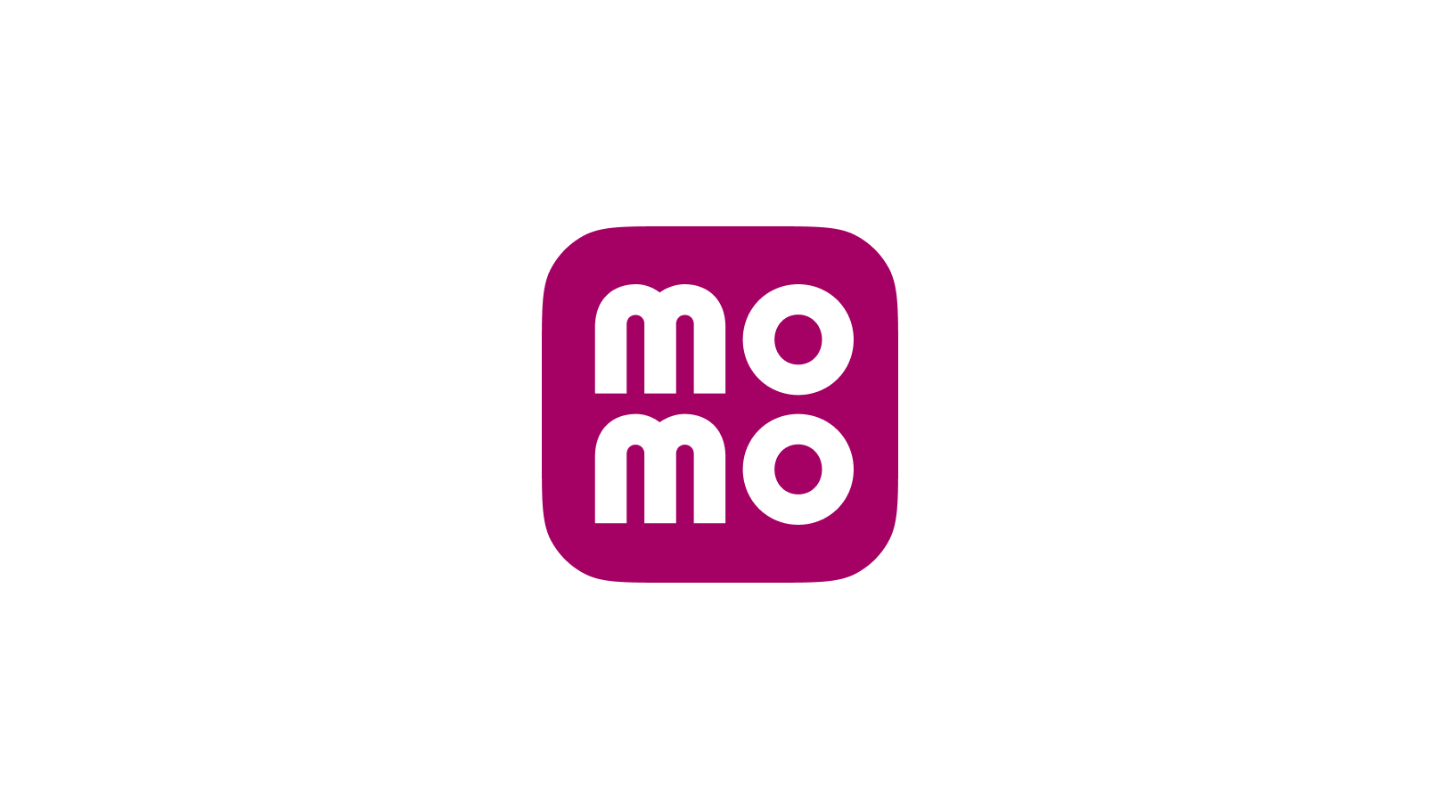
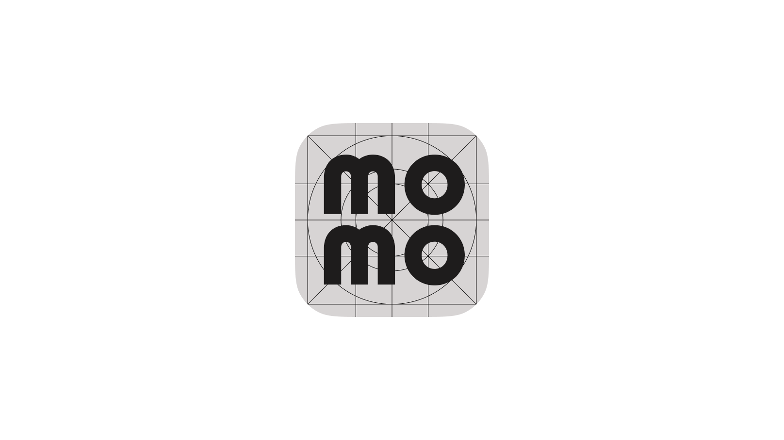
The main logo on the app icon follows the general grid design of the operating system and includes a designated safe zone.
Refer to the illustration for the grid layout of the app icon logo. This guideline cannot be altered except in exceptional cases and only with approval from the brand management team.
Application icon on communication platforms
To ensure accurate and consistent representation across communication platforms, refer to the example on the right for the layout and placement of the MoMo app icon.

Safe zone
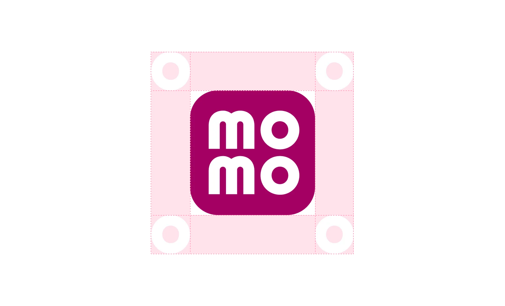
To ensure clear visibility on in-app banners or publications, the app icon must be centered within a safe zone consisting of four equal empty spaces surrounding it. The size of each empty space must be equivalent to the height and width of the “O” character in the app icon.
Follow the safe zone guidelines as illustrated. For precise alignment, ensure that no characters extend beyond the baseline or cap height.
Color application for app icons
App icon colors on colored backgrounds
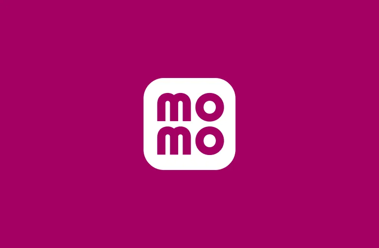
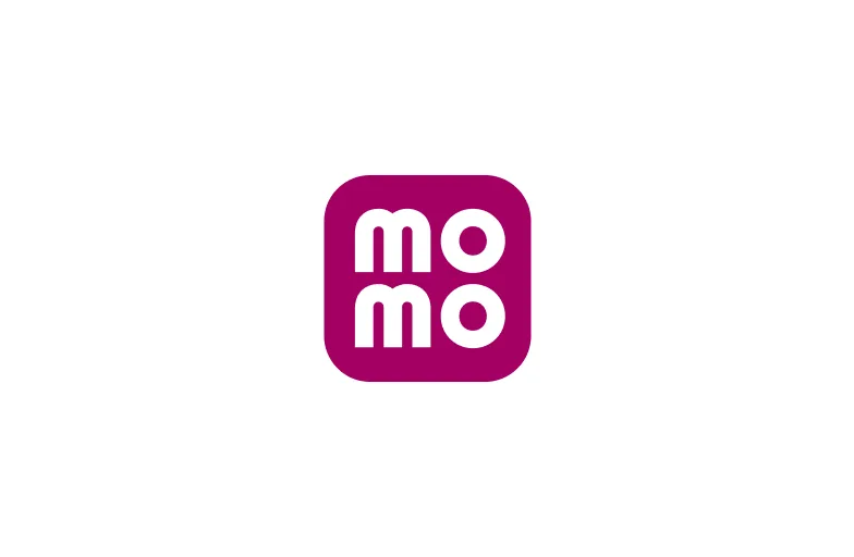
Below are guidelines for applying app icons on colored backgrounds to maintain optimal contrast. Ensure that the correct color combinations are used as outlined, with each background requiring a specific corresponding app icon color.
Since this is primarily for internal use, the secondary logo colors are limited to the signature color palette and the MoMo Pink secondary palette.

Improper usages
To ensure consistent brand recognition, the MoMo logo must remain unchanged and adhere to the defined brand usage guidelines. Below are examples of improper logo applications.
For any logo applications not mentioned in the brand guidelines, consult the brand management team before proceeding.

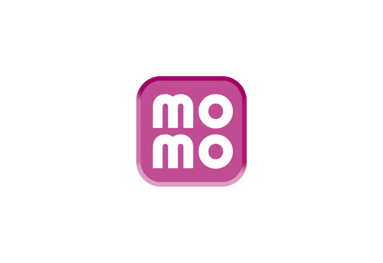
Using incorrect logo colors. 
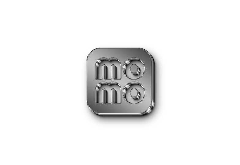
Misusing logo-background color combinations. Changing the logo's opacity. Using outdated versions of the logo with the wordmark. Placing the logo within a frame. Adding shadow effects to the logo. Overlaying patterns on the logo. 
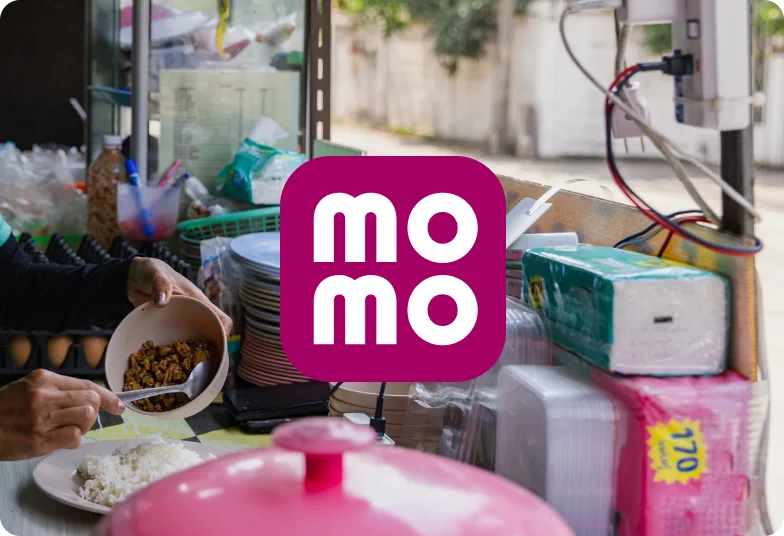
Altering the logo's structure or layout. Using an outlined version of the logo. Distorting or resizing the logo disproportionately. Adding embossing effects. Adding textures or 3D effects to the logo. Placing the logo on overly detailed backgrounds.


The "m" icon
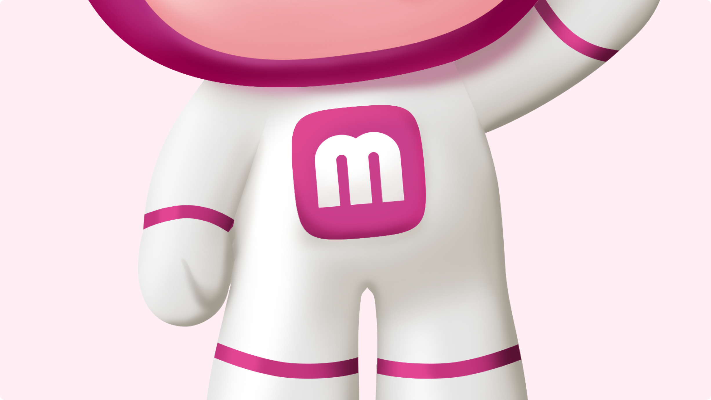
The “m” icon is a simplified and playful version of the MoMo logo.
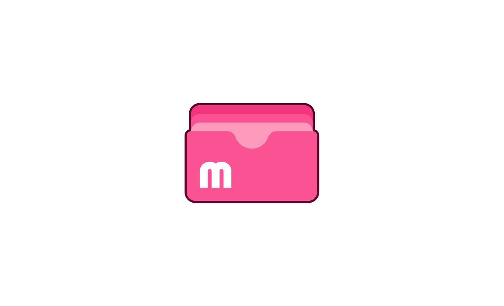
This version of the logo appears in MoMo’s mascots or in other brand touchpoints, such as illustrations, in-app icon sets, or brand visuals accompanying the main logo.
It is important to note that this is not MoMo’s main logo and should not be used independently on any external media platforms.
Safe zone
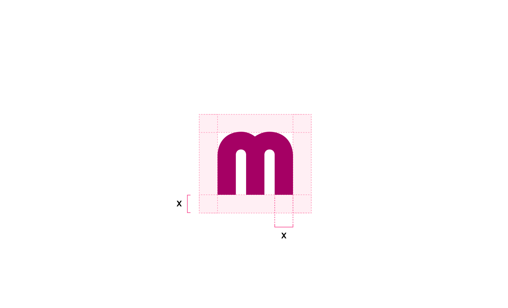
To ensure optimal visibility, the “m” icon requires a designated safe zone around it. This safe zone should be equal to the width of the base of the letter “m,” as illustrated alongside.
Frame and signature colors
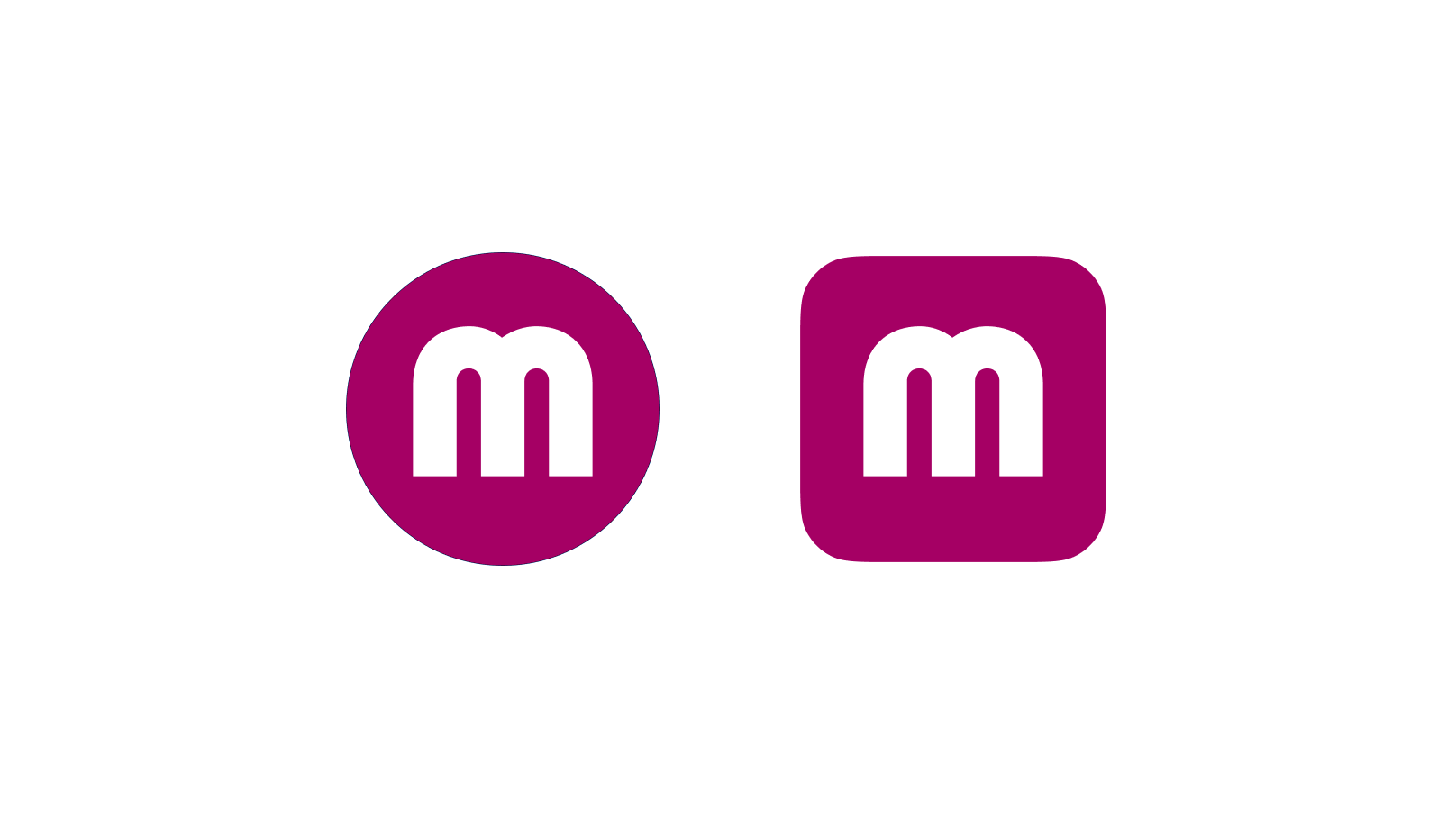
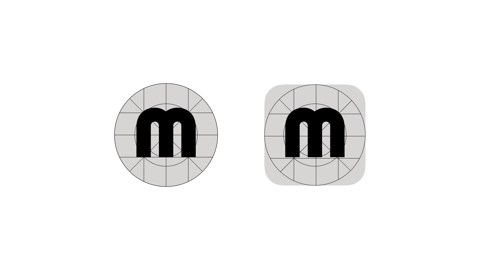
When the “m” icon is used in MoMo’s mascots or illustrative designs, it should be enclosed in a circular or rounded square frame and set against the brand signature color backgrounds.
Color application for the “m” Icon
The “m” Icon on colored backgrounds
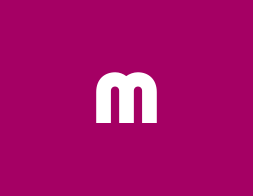
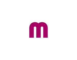
The “m” icon, when used across different printed materials and communication platforms, should be placed on a colored background to enhance visibility and maintain proper contrast.
Below are examples of how the “m” icon can be applied to the brand’s approved background colors. Be sure to follow the listed color pairings, ensuring the background color matches the designated icon color. Since this icon is primarily for internal use, its color palette is limited to the signature brand colors and the extended pink palette.






Improper usages
To ensure consistent brand recognition, the MoMo logo must remain unchanged and adhere to the defined brand usage guidelines. Below are examples of improper logo applications.
For any logo applications not mentioned in the brand guidelines, consult the brand management team before proceeding.

Using incorrect logo colors. Misusing logo-background color combinations. Changing the logo's opacity. Using outdated versions of the logo with the wordmark. Placing the logo within a frame. Adding shadow effects to the logo. Overlaying patterns on the logo. Adding embossing effects. Adding textures or 3D effects to the logo. Distorting or resizing the logo disproportionately. Misusing secondary logos or the 'M' symbol as the primary identifier. Placing the logo on overly detailed backgrounds.