Logo
Main logo
Main logo
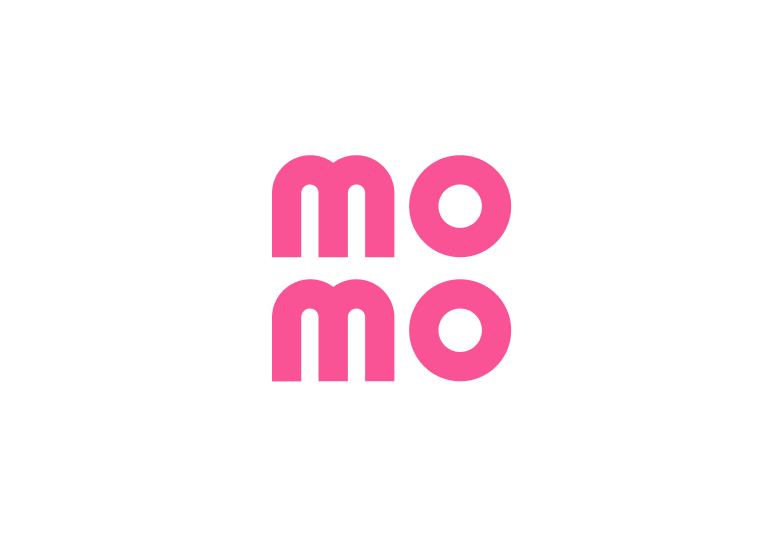
The main MoMo logo consists of two “Mo” letters placed inside a square. It is an essential part of all MoMo’s advertising materials and banners.


Safe zone
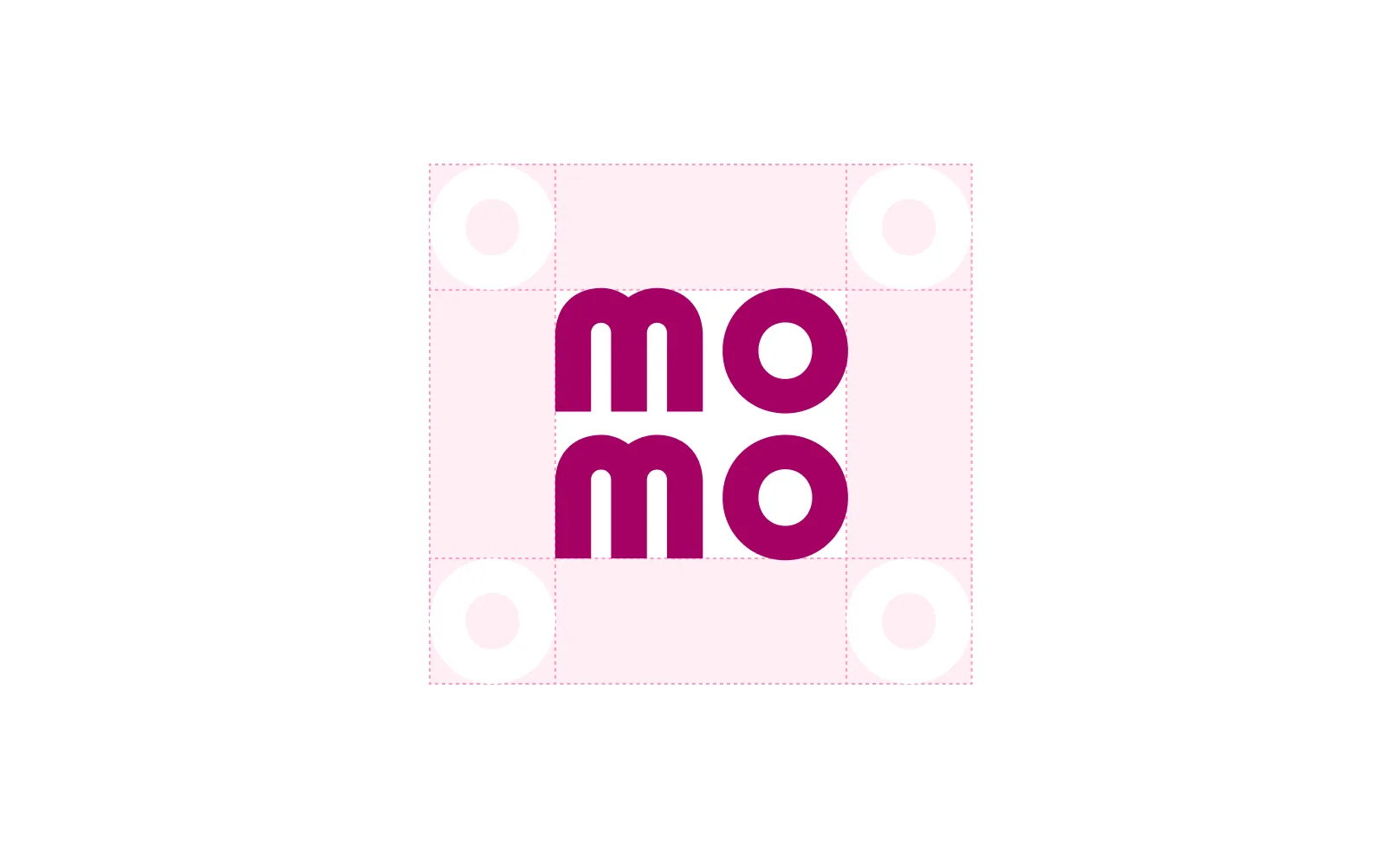
To keep the main logo clear and visible, it must be placed within a safe zone that maintains enough space between the logo and other design elements. The principle for using the Main logo to ensure optimal visibility are listed below.
Full version
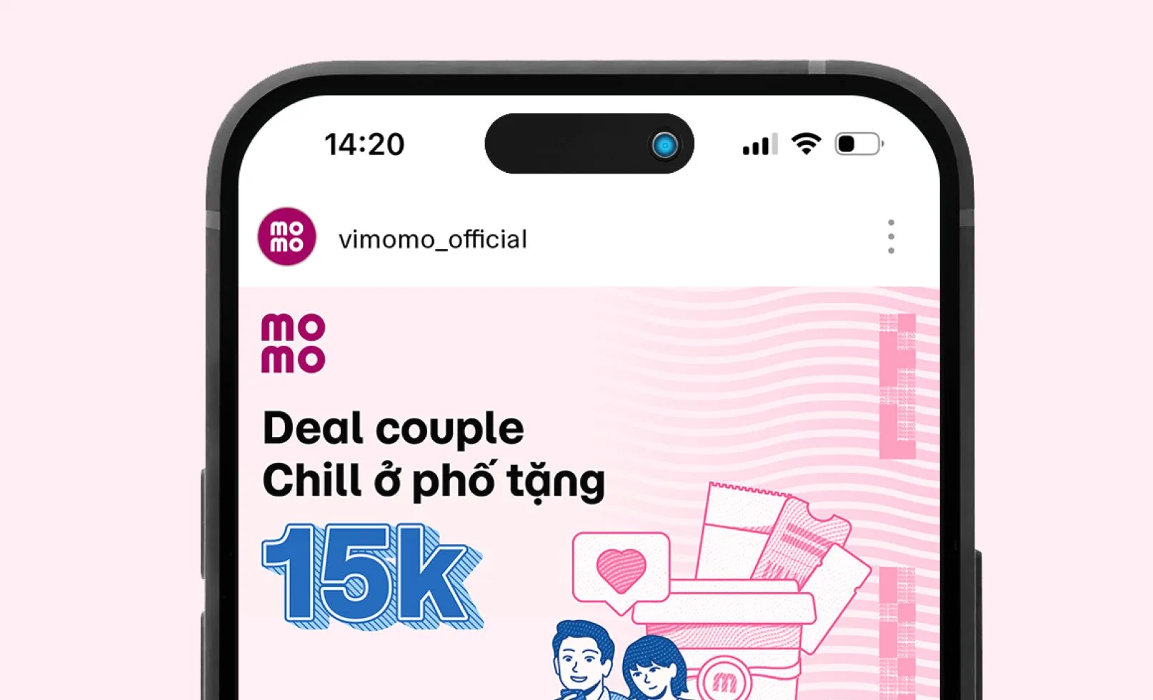
For applications like social media posts, app screens, and advertisements, the logo should be centered with equal spacing around it. The space should match the height and width of the “O” in the logo.
Follow the safe zone guidelines provided. To ensure accuracy, avoid allowing the circular characters to extend beyond the baseline or cap height.
Partial version
For large formats like billboards, posters, or standee, etc., the safe zone should be one-quarter of the “O” in the logo.
Follow the safe zone guidelines provided. To ensure accuracy, avoid allowing the circular characters to extend beyond the baseline or cap height.


Applications
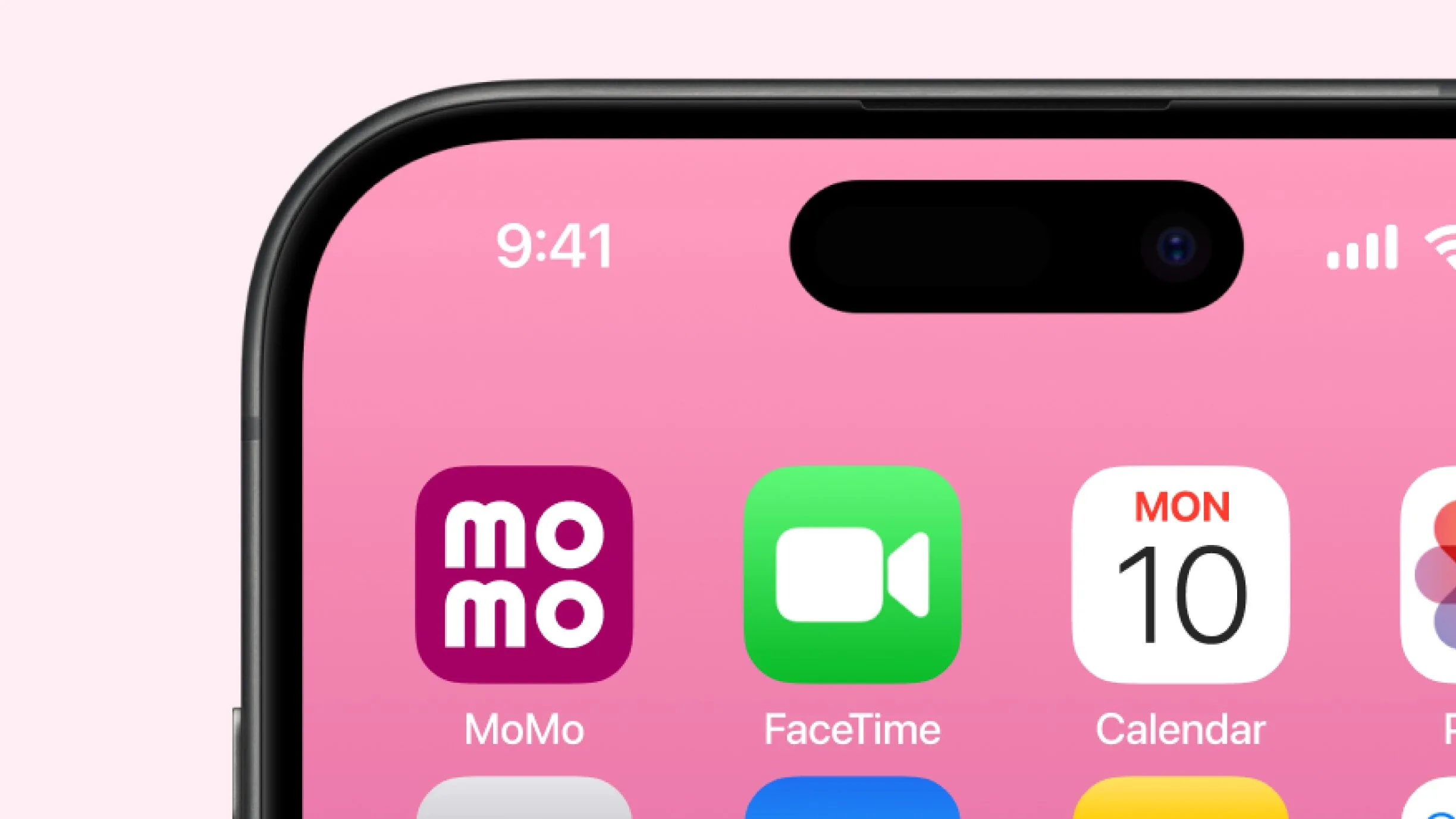
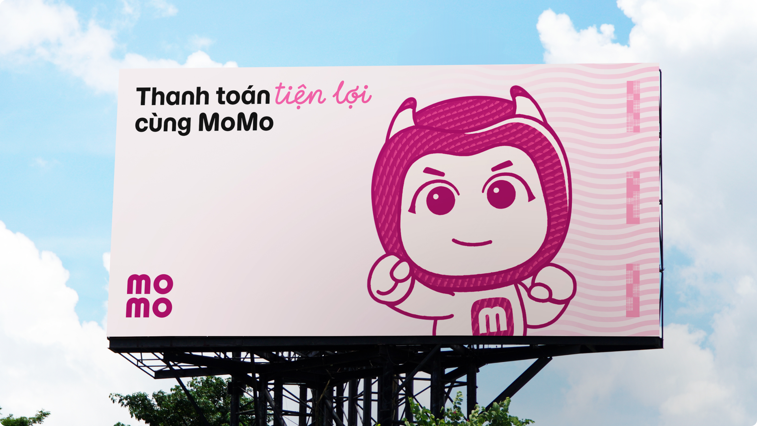
The MoMo logo is present everywhere—from daily payment platforms and print materials to social media and mass media. This creates a seamless, consistent experience, enabling MoMo users to recognize and connect with the brand anytime, anywhere.
Minimum size
To maintain clarity and avoid losing details, adhere to the following size requirements:
Printed Materials
The MoMo logo should not be smaller than 10mm.
Digital Platforms
The MoMo logo should not be smaller than 30px.


Logo placement
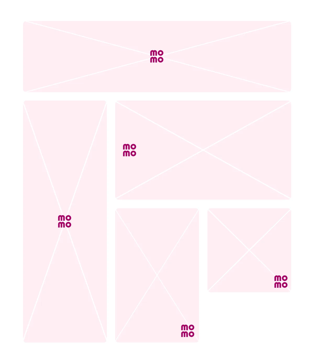
The placement of the main logo ensures optimal visibility across various media platforms: on the app (MoMo logo + partner logo), on social media and websites (small-sized logo), and on vertical outdoor billboards (larger-sized logo).
The visual examples below illustrate logo placements. For more details on specific sizes and placements for different media platforms, refer to the “Backgrounds” section in the “Layout System.”

Color usage
MoMo logo on colored backgrounds
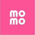
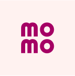
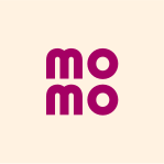
To maintain proper contrast, follow these color application guidelines when using the main logo on the brand’s color system backgrounds. Ensure correct color combinations for each background as specified.




















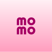








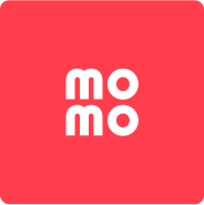
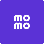


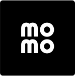






MoMo logo on images and video backgrounds
To ensure proper contrast, follow these guidelines when applying the main logo to image or video backgrounds. Use the correct logo colors for each specific case.


Improper usages
To ensure consistent brand recognition, the MoMo logo must remain unchanged and adhere to the defined brand usage guidelines. Below are examples of improper logo applications.
For any logo applications not mentioned in the brand guidelines, consult the brand management team before proceeding.

Using incorrect logo colors. Misusing logo-background color combinations. 
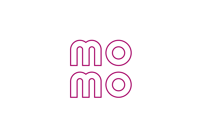
Changing the logo's opacity. Adding textures or 3D effects to the logo. Overlaying patterns on the logo. Adding embossing effects. Adding shadow effects to the logo. Placing the logo within a frame. Altering the logo's structure or layout. Replacing the word "MoMo" with the logo in text. Distorting or resizing the logo disproportionately. Using an outlined version of the logo. Misusing secondary logos or the 'M' symbol as the primary identifier. Placing the logo on overly detailed backgrounds.